Africa Check’s work regularly sends us looking for press releases, reports, and other information released by government agencies and departments. But to our frustration, this information is often much harder to find than it should be.
Many government websites are poorly organised, out of date, and difficult to navigate. This makes finding relevant information a nightmare. It doesn’t only affect the work of fact-checkers and journalists. Ordinary people also often need to access government information, and have a constitutional right to do so.
We asked Africa Check’s researchers in South Africa about the websites they dread visiting, and what these sites get wrong. We also asked about websites that get things right and make finding information a breeze.
The following examples aren’t necessarily the worst (or the best) South African government websites. But they’re useful case studies for anyone who wants to communicate information clearly and effectively. They’re also a window into the daily life of a fact-checker.
Missing: has anyone seen the Department of trade and Industry?
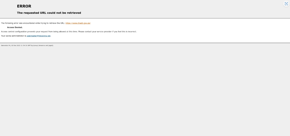
Many government websites struggle to remain up to date. One of the worst offenders is the Department of Trade, Industry and Competition (DTIC), which seems to have an unusual website error.
The URL linked to by the government’s official links page (thedtic.gov.za) returns an error, as does a Department of Trade and Industry site (thedti.gov.za) linked to on other information pages. Internet Archive results show that while the DTIC site is often accessible, it has often returned these kinds of errors in the past.
At the time of writing some Africa Check researchers could access the site. But several people using different devices and browsers all got the error below, instead of the DTIC website.

Other websites have outdated or missing information. The department of agriculture, land reform and rural development website was also returning an error at time of writing but was again accessible when we published this article.
Africa Check wrote earlier this year about how outdated government websites made it easier for social media users to impersonate ministers and spread misinformation. This year we’ve seen fake government housing scams, social media impersonators, and job scams shared by Facebook accounts with government logos.
Navigating the maze at the department of basic education
A disorganised website can be a nightmare to navigate. Take the Department of Basic Education’s website as an example.
The department’s reports are particularly poorly organised. They’re all hosted on the same page and grouped into sections. But there is no way to easily navigate between the sections, which are ordered differently (some in time order, others in reverse time order). So finding a particular report involves scrolling through the whole page rather than being able to immediately jump to a relevant section.
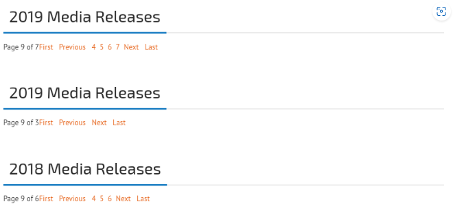
Even worse is the media releases page of the site. The releases are organised under different headings on one page, again with no easy way to navigate between sections. To add to this, the sections are not comprehensive – there are two named “2019 Media Releases”.
Several sections on the media releases page are cut off and require you to navigate between sub-pages to see all the media releases in those sections. Doing so reloads the whole page, forcing you to start your search from scratch. It also sometimes results in bizarre empty sections that look like this.

(It’s difficult to describe, but for a taste of how confusing it is, spend a few minutes trying to find this press release on this page. You’ll quickly understand why we get frustrated.)
As a final headache, the page uses an extremely small font, which makes it difficult to see whether your cursor is hovering over the right link.
Sassa - not much to look at
It might not seem like an “ugly” website would make it difficult to access its information. After all, if the info’s there then why should it matter what the site looks like?
But poorly designed websites can make information tough to find, especially when that information is also poorly organised.
The South African Social Security Agency, also known as Sassa, is responsible for providing social services. These are mainly in the form of social grants such as the disability, child support and social relief of distress (SRD) grants – like the one introduced to minimise the impact of Covid.
Many people rely on these grants, so it is especially important that information about them is easily accessible, no matter what experience people have in using the internet. Unfortunately, it is not.
Sassa has an ugly website. It is awkwardly sized on both desktop and mobile browsers, sometimes making critical information impossible to read.
The Sassa page about the Covid SRD grant, for example, lists application requirements only in the form of a low-quality image, partially cut off by the bottom of the page.
The image also doesn’t have alternative or alt text that could be read by a screen reader. This technology reads the words on a screen for a user who has difficulty reading or can’t do so at all. This means that someone with poor eyesight, for example, may be unable to access this important information.
Other information on the site is also poorly organised. The statistics reports page, for example, includes reports with vague titles like “July 2022 report”, often in different formats.
All these issues mean that even someone familiar with the site (say, an Africa Check researcher who may need to visit it regularly) can’t be sure where to find the information they need.
Someone who isn’t a professional researcher, who has to navigate the site’s terrible layout on a phone, or who relies on tools like screen readers, could find it impossible to find what they’re looking for.
Statistics South Africa
Our pick of bad websites may seem discouraging, but there’s good news too.
Statistics South Africa, the national data agency known as Stats SA, is a shining example of easily accessible data. We’ve written about the importance of good statistics in the past. Stats SA not only publishes reliable data but makes it readily available.
The site’s home page suggests commonly used statistics by theme, making the latest data on topics like employment, mortality, and poverty easy to find.
Stats SA also makes it easy to find past data. All reports are archived into a list (see the quarterly labour force survey as an example) that clearly labels the most recent edition of the report, as well as all previous editions.
On relevant pages, Stats SA publications also suggest contact information for expert statisticians. They also provide additional downloads other than the report itself (this sometimes includes the raw data used in the report), and link to an “about” page that explains what the report is.
This should be the standard that other departments and agencies strive to achieve. We all need information that is up-to-date, easy to find, and transparent.
Basic education? Wasn’t this one of the bad ones?
We’ve already complained about the poor layout of the department of basic education website. But the site does do some things right.
The information on the site is difficult to navigate, but there’s a lot of it. One of our researchers noted that the site is regularly updated. And it includes information relevant for anyone who might regularly come into contact with the department – teachers, parents and guardians, and students.
The department even hosts information that many others don’t, like a list of parliamentary questions it has answered. This isn’t strictly necessary since these are also available on the official parliamentary website. But it is convenient to have all the questions relevant to basic education available in one place.
We just wish it were better organised.
Small conveniences: gov.za
Much of what makes the main South African government portal(gov.za) so good is that it works so well you might not give it a second thought – until you visit a site that doesn’t do things so well.
The site’s search function is an example. You’re able to search narrowly by fields such as “government level” and “province”. So it’s easy to find, for example, something as specific as a speech relevant to the governance of Gauteng province made in the first half of 2022. Without even entering any keywords, we were able to narrow the results down to just two speeches.
The site also makes helpful context about documents available in text format. This makes documents easier to find and read, by reducing the need to download and scroll through PDF files for information.
For example, the page that links to the National Health Act includes a short description of what the act is meant to do, when it was introduced, which laws it replaced, and the later legislation that altered it.
Important speeches such as the State of the Nation Address appear in their entirety. Included are translations into several (sometimes all) official South African languages. This makes them accessible to people who may not speak English as a first language or may have difficulty reading and have to rely on screen readers.
This doesn’t mean gov. za is perfect. In one of our fact-checks this year, we pointed out that its contact directory could use updating.
But the small improvements that make the site easier to access are helpful to researchers working to deadline, as well as to ordinary people who need easy access to important information.
Who’s in charge of all this?
Government websites are all separately administered, but there are guidelines set by the government communication and information system, GCIS.
The guidelines stress that a government website “must be properly maintained and updated”. They even include recommendations similar to many of the criticisms we’ve made above – covering how to organise information to good practice when designing search tools.
The guidelines aren’t arbitrary. As we’ve explained, keeping a website up-to-date and easy to use is necessary for South Africans to exercise their right to access information.
The websites we’ve looked into here show how some departments and agencies are making it easier to exercise that right, and how others are falling short.
Published by AFRICA CHECK